
Artistic Depictions of Climate Change Challenging Politicization

Environmentalist protestors set up a tent city on the street in front of the European Climate Exchange. Image by Charles Hutchins. Licensed under CC BY 2.0.
By Lauren Hodges
As climate change continues to be an important topic in the media, artists and scientists are looking for more creative ways to display climate data. Traditional depictions of climate data have been shown to have polarizing effects on people who have preconceived notions about climate change. In addition, these depictions can also heighten skepticism about the actuality of climate change. So how do we combat this?
A new study published in Nature found that a simplified Keeling curve alongside a climate-centric piece of artwork can help increase feelings of hope and/or anxiety while maintaining credibility.
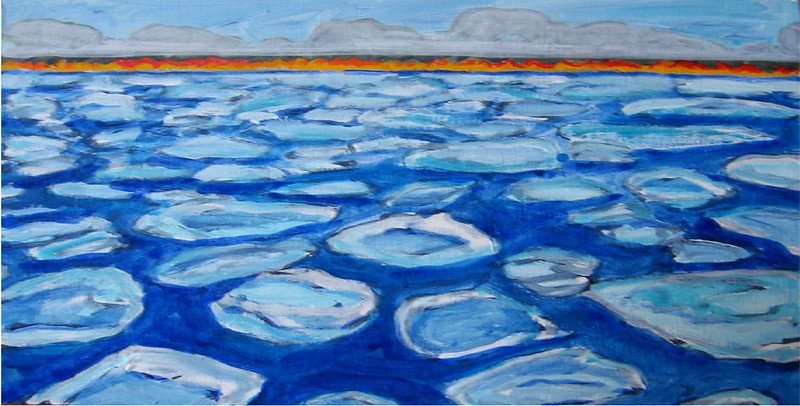
Fire on the Horizon. Created by Natasha Mayers. Licensed under CC BY-SA 2.0. *NOT THE ART SHOWN IN THE STUDY
Gaps in opinion about the urgency to act in the face of climate change data and the best policy direction to take are widening between liberals and conservatives. And people “tend to interpret climate data through a political lens and use the provided data to justify their preexisting beliefs”. However, when people experience anxiety when viewing climate data, it can lead them to reassess the data that contradicts their beliefs.
There have been studies that found that artistic visualizations can elicit strong emotions, but little evidence exists on how retention of knowledge differs when viewing these artistic depictions versus data graphs.
In this study, one group of participants were shown a simplified Keeling curve by itself and another group was shown “Summer Heat" which included the same Keeling curve. The Keeling curve shows the amount of carbon dioxide in Earth’s atmosphere and is commonly used to show the warming trend of Earth’s surface. “Summer Heat” is an artistic representation of climate data and shows an abstract map of Europe and melting glaciers.

The Keeling Curve, December 2014. Created by Scrippsnews. Licensed under CC BY-SA 4.0.
When participants were asked about how the data/images made them feel, researchers found that participants had stronger positive emotional responses to the artistic visualizations. Additionally, when participants reflected on the artistic visualizations they were “less politically polarized in their perceived relevance of climate change” as opposed to when they viewed the graphs.
This study offers evidence that artistic visualizations of climate change data can be more impactful than data graphs. Understanding how we respond to different depictions of data helps inform how science and art can work together during the impending environmental crisis.